
The resources below will be updated for the 2025 Summit soon... Please stay tuned for more information!
The Duke CFAR Research & Engagement Summit is a time for all of the HIV/AIDS investigators at Duke to get together and share their current work. Below, we have gathered resources to assist with creating a poster or an infographic or preparing a talk for an interdisciplinary audience. For additional feedback or support preparing for the retreat, you can schedule a consultation.
Call For Abstracts - PDF
Eric Monson’s Effective Academic Posters talk with resources that go with it http://bit.ly/EffectivePostersSpring2022
Better Posters https://www.insidehighered.com/news/2019/06/24/theres-movement-better-scientific-posters-are-they-really-better
Purpose: Scientific posters are often written for a discipline-specific audience and contain a lot of text. The purpose of this infographic flyer is to communicate key takeaways of your research and research process to a general audience with the use of helpful visuals and clear language.
Key Information:
- Infographic flyers should be created on a standard 8.5x11 piece of paper and use readable fonts (recommended minimum font size of 16pt)
- Avoid jargon! If there is a term you feel is important to use that won’t be known by a wide audience, be sure to define it using plain language
- Focus on a key message – What is important for someone in the public to know about the work that you do?
- Use visuals – avoid directly copying a figure or graph from a paper or poster. Instead, think about your key message and what can help support that information. Do you want to visually highlight an important statistic? Is it helpful to illustrate a process happening in the body or a cell? Can you create a visual metaphor? Is there an image that can help put context to your key message?
- Make it readable! Use white space, and keep it simple as needed so your key message comes through.
- Think about your audience – You can even try showing it to a friend or family member who isn’t familiar with the science behind your research and get their feedback. Do they understand what you are communicating? Is it interesting?
Helpful resources:
- There are many tools and software available to help create infographics, including free versions. A few we recommend:
- Canva: https://www.canva.com/
- Venngage: https://venngage.com/
- Piktochart: https://piktochart.com/
- Visme: https://www.visme.co/
- There are also many tools available to help create scientific illustrations and guides that compare options and give tips
- Here is a video on How to Make an Infographic in 5 Steps that may be helpful as you work on your design
- This video gives examples of some more complex infographics – yours can be simpler, but hopefully the tips are still helpful!
- As you think about defining your “burning problem,” it can help to think about the public health relevance of your research. How does it apply to individuals or communities? Why is it important?
Examples and Inspiration
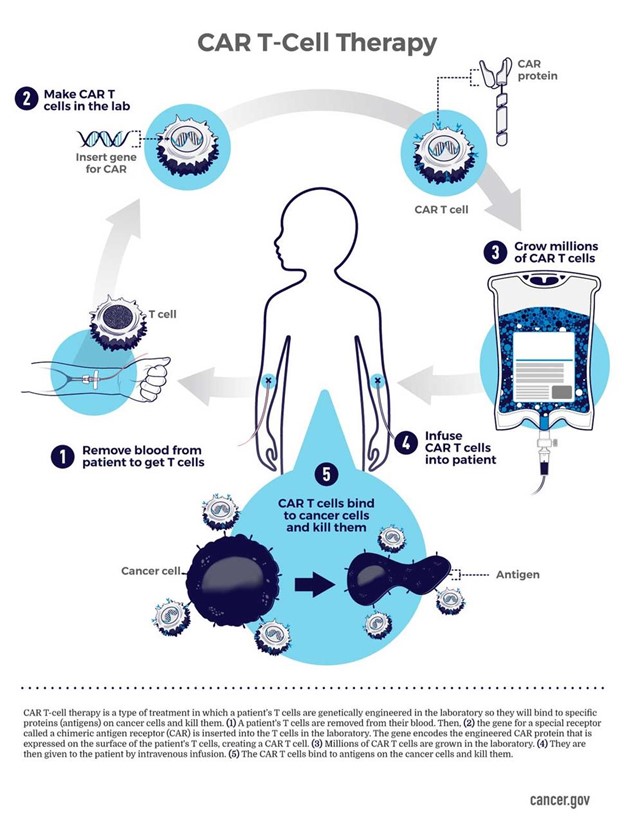
As you can see from the examples below, there is a wide variety of what an infographic could look like! Note what things you like or don’t like about the examples.
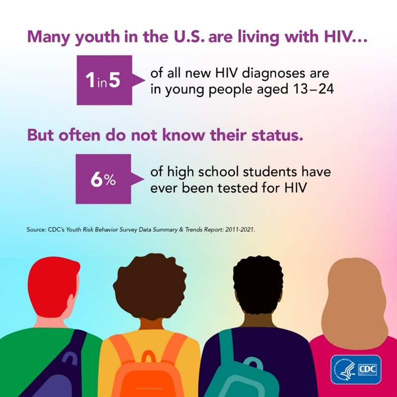
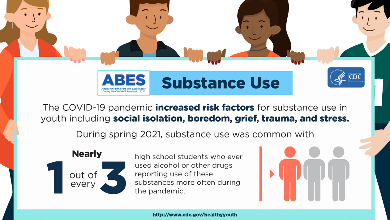
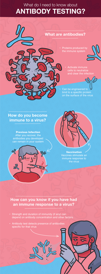

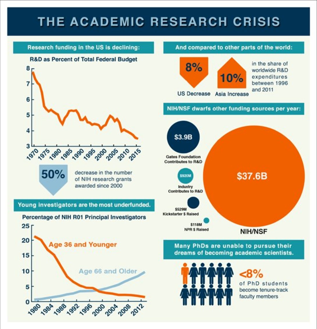
LinkedIn: What are the key elements of a compelling scientific infographic?
Purpose: This style of talk differs from a traditional academic presentation. The goal is for these talks to be engaging and accessible to the interdisciplinary audience at the CFAR Retreat and to focus on the big ideas and takeaways from the research process that would be most meaningful to others (which may not be purely the “Results” from your project).
Key Information:
- Title: Please choose a dynamic, “interdisciplinary-friendly” title for your talk
- Some example TED talk titles pulled for reference include: Flip Your Thinking on AIDS in Africa, PrEP for HIV Prevention: The Best Worst-Kept Secret, Telemedicine is the Modern Doctor’s House Call, Hackers: The Internet’s Immune System
- Time: Firm 15-minute slot for each talk (with a 5-minute Q&A)
- Key Point: finishing in under 15 minutes is much better than going over 15 minutes
- Topic: As you are planning your talk, consider selecting one of the following topics to focus on:
- An innovation that your team is very proud of.
- A challenge that your team overcame.
- A piece of information that it’s vital for every CFAR member to know.
- How your background and identity shapes your research.
- How you connect your work to the broader community.
- Audience: Unlike a normal TED talk, we aren’t asking you to design this talk for an audience that knows nothing about HIV. You can assume everyone knows the basics of the HIV epidemic. However, keep in mind that CFAR members include individuals across disciplines (non-scientist community members, bench scientists, clinical trialists, epidemiologists, statisticians, social scientists, etc.). We have also invited members of the D3C, community members with lived experience related to HIV that help support the CFAR.
- Guidance: Consider following this helpful guide for structuring your talk: https://speakerflow.com/how-to-write-a-ted-talk-in-7-easy-steps/
- Slides: You may find visuals, brief text, or multimedia content (e.g., short videos) helpful to include to enhance your presentation.
TED Talk Examples
Here are a few examples of TED Talks that might be helpful for general communication and storytelling skills/examples:
- Why I'm an architect that designs for social impact, not buildings | Liz Ogbu | TEDxMidAtlantic – uses illustrative stories to give examples of design challenges and reframing of research questions, goals, and approaches
- What makes a good life? Lessons from the longest study on happiness – good example of summarizing key takeaways from a research study and ending with application to audience
- How mRNA medicine will change the world – good example of explaining more complicated concepts in an easy to understand way
Thuy Le gave a great talk at the 2022 CFAR Retreat, “Ten Commandments of Research Success” [Duke Login required]